A bold, technical identity for a next-generation cybersecurity firm built to communicate precision, authority, and digital intelligence.
Fronxit came to us with a clear directive: create a visual identity that communicates technical mastery, digital precision, and enterprise-grade trust — without falling into tired cybersecurity clichés of padlocks and shields.
The brand needed to scale from small-format digital icons to large-format physical installations while maintaining legibility and impact at every size.
"The industry defaults to the same visual language — we needed something that felt genuinely different while still reading as credible and authoritative."
— Design brief, Fronxit
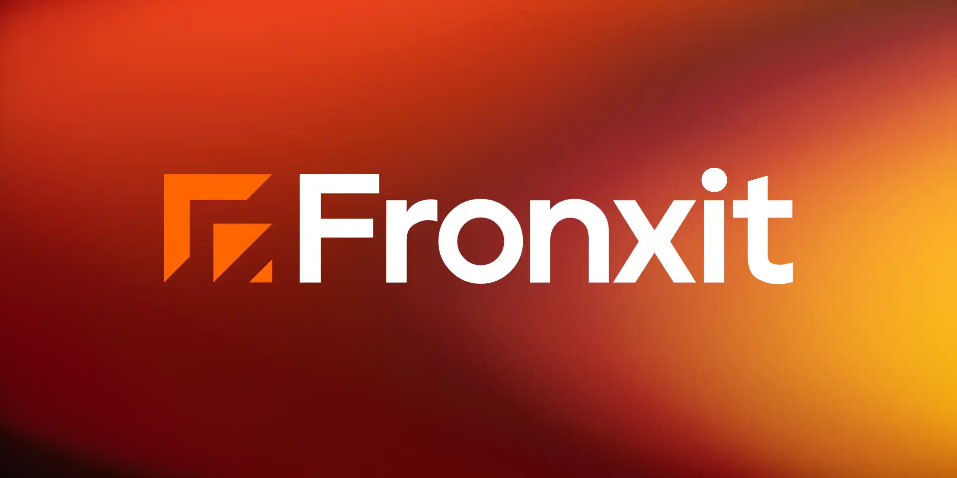
We began with a two-day brand strategy sprint — distilling positioning, competitive landscape, and visual references into a tight creative brief. The mark exploration was grounded in geometry: angular constructs that suggest both a network topology and a forward-facing shield form.
Typography was selected for extreme legibility at small sizes, with a custom wordmark modification to the primary typeface that created differentiation without sacrificing readability.
"Craftsynk delivered something we didn't think was possible in three weeks — a complete brand system that feels both timeless and unmistakably ours. The strategic depth behind every decision made the difference."